How to Embed Bar Charts in a Tableau Table
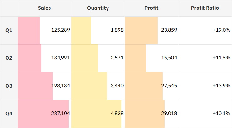
Here’s a way to enhance the effectiveness of grid charts that typically display data in text form by adding bar charts directly into the table.

Step-by-Step: Embedding Bar Charts
- Connect Placeholder data to your data source by following the provided guide.
How to Add a Placeholder to Your Tableau Data Source
This method explains how to connect Placeholder data, giving you more flexibility—similar to Excel—and enabling a broader range of visualizations.

- Create calculated fields to serve as headers.
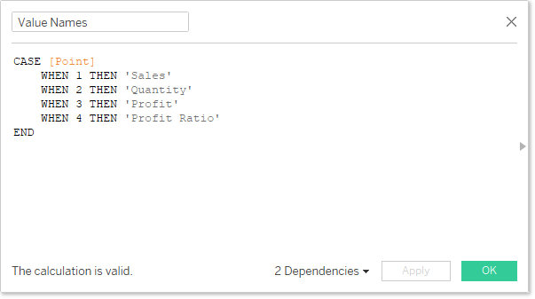
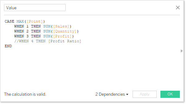
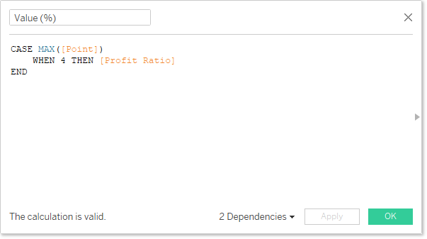
- For each header, generate the corresponding values through calculated fields.
💡
Since each measure can only have one format, if different formats are needed, create separate calculated fields for each format.
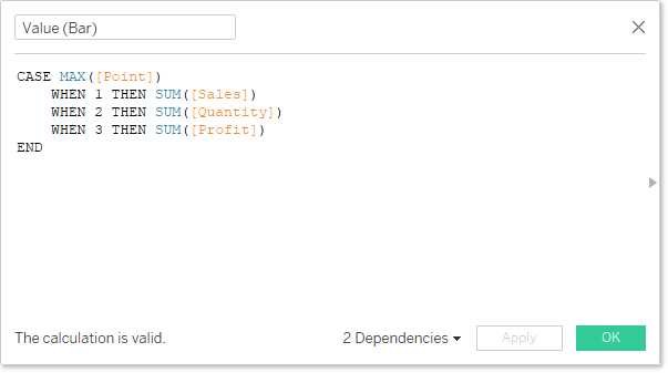
- Create a calculated field for the sections that will be represented as bars.
- Arrange the calculated fields like this:
- Marks: Bar
- Label: Value, Value (%)
- Size: Value (Bar)
💡
If you use the value directly for size, the axis will scale uniformly. To display varying sizes proportionally, adjust the configuration using table calculations for consistent scaling.