Using Bar Charts in Tableau
Bar charts, along with line charts, are among the most fundamental types of charts and can be useful in most situations. While creating bar charts is simple and widely done, I'll introduce ways to enhance their impact through subtle differences.
Horizontal for rank and list, vertical for flow and comparison
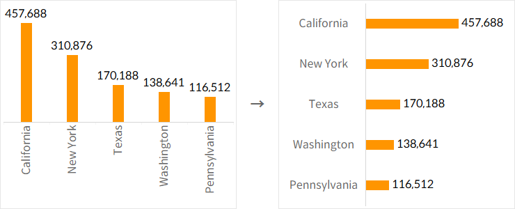
Using a horizontal bar chart is beneficial for expressing the hierarchy between items, as they are arranged vertically. Additionally, when dealing with a long list of items, horizontal bar charts are ideal for encouraging vertical scrolling.
Vertical bar charts, with items arranged horizontally, are well-suited for representing sequential flows, such as time. Similarly, since the values of indicators are displayed side by side, vertical bar charts are effective for comparing the values of different items.
Use horizontal bar charts when labels are long
When deciding between horizontal and vertical bar charts, it's important to consider how to distinguish the indicators and the length of the text labels. If the text labels are long, they will need to be rotated in a vertical bar chart, which significantly reduces readability.
Consider header placement in vertical bar charts
In Tableau, the headers for vertical bar charts are set to be positioned at the bottom by default. However, since people typically read content from left to right and top to bottom, having headers at the bottom can hinder data interpretation.
For scenarios like time series, where the flow is clear and understanding doesn't require reading each text individually, placing the headers at the bottom of the bars is effective. However, if it's important to read each distinguishing text to understand the data, positioning the headers at the top of the bars is more efficient.
Label display should be selective based on the situation
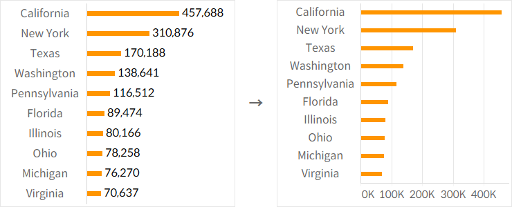
There are cases where it’s essential to see the exact values of indicators, and others where you only need to understand the overall size of dimension values. However, it’s important to remember that displaying too much text on the screen can reduce overall readability. If a large amount of text is necessary, considering alternatives to bar charts may also be advisable.
Combine bold bar charts with gantt charts
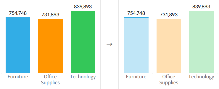
The thickness of bars in a bar chart can be adjusted depending on the situation, but overly thick bars can lead to excessive color visibility and color fatigue. In such cases, combining bar charts with Gantt charts can help manage color representation more effectively.
