How to Create Butterfly Chart in Tableau
Learn how to create a butterfly chart, a great way to compare two datasets side by side.
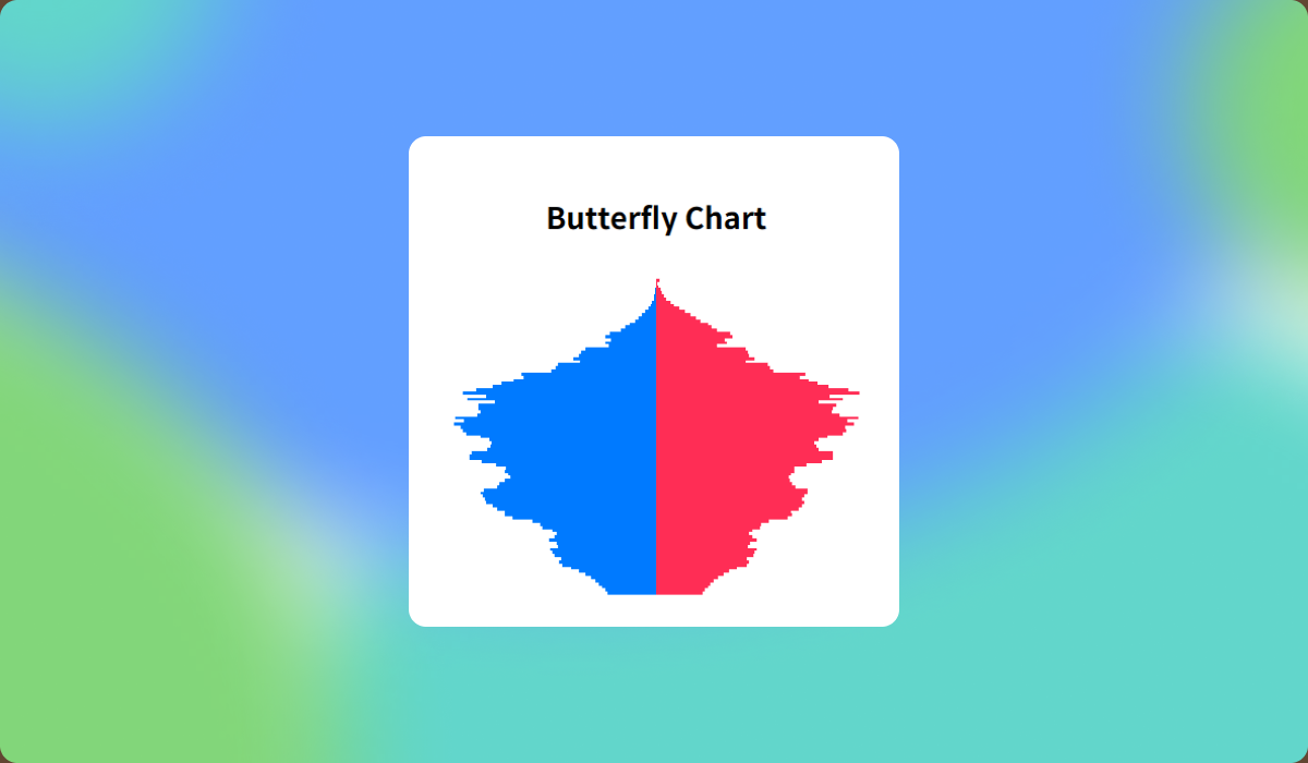
Butterfly Chart is a type of bar chart that spreads symmetrically, resembling butterfly wings. It’s particularly useful for comparing opposing values, such as Male vs. Female, Yes vs. No, or Online vs. Offline, using a common scale.
In this post, we’ll use South Korea’s 2025 population projection data from Statistics Korea to create a Population Pyramid in Tableau.
Step-by-Step: Building a Population Pyramid
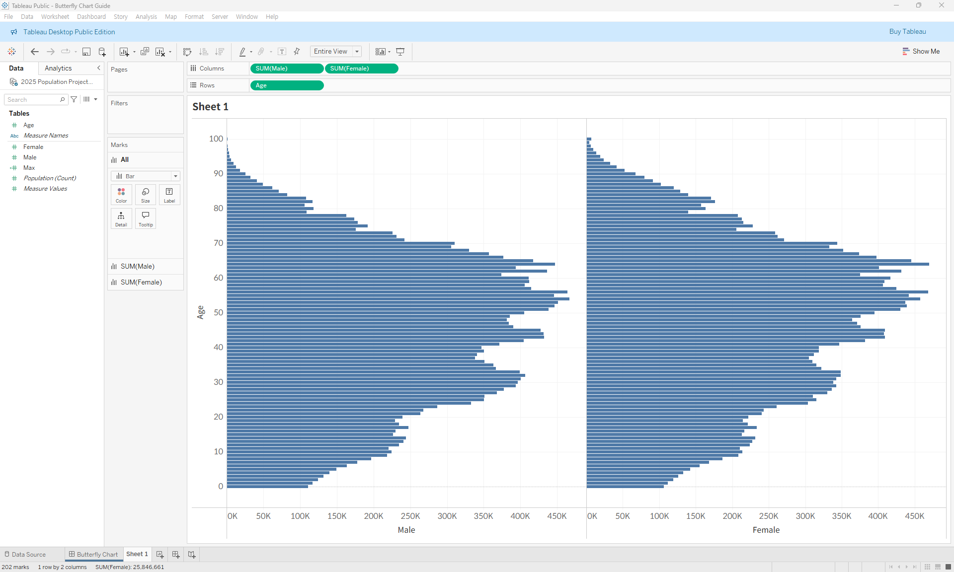
- Drag the Age field to Rows and place the Male and Female fields as bar charts on Columns.
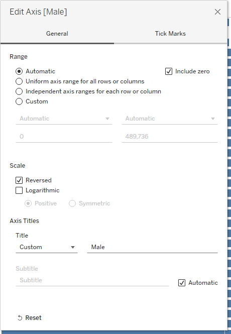
- Reverse the axis for the Male measure on the left.
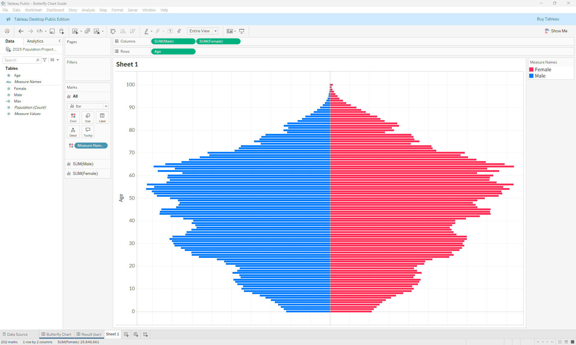
- Use the Measure Names field to assign colors.
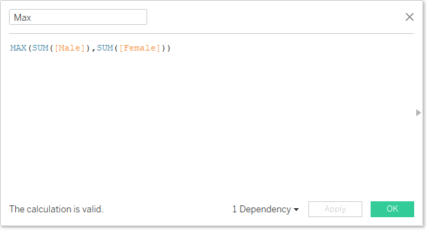
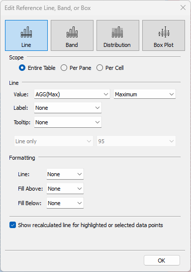
- To keep both bars symmetrical, create a calculated field that returns the maximum value between the two measures. Add this as a reference line on both sides, and hide the label, tooltip, and line.
- Fine-tune the formatting to complete the chart.
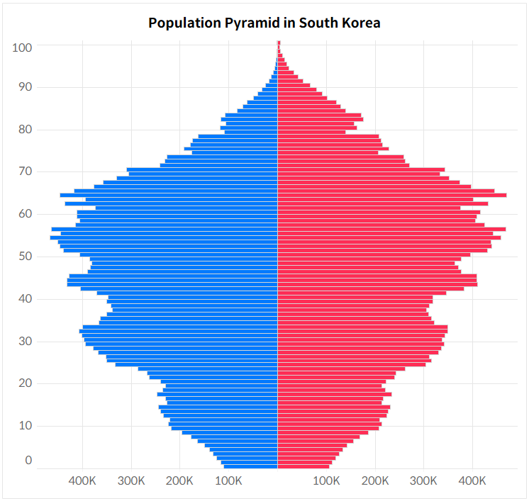
You can download the Tableau file below to explore the details further.

