How to Create Candlestick Chart in Tableau
This guide explains how to create a candlestick chart, commonly seen in stock charts.
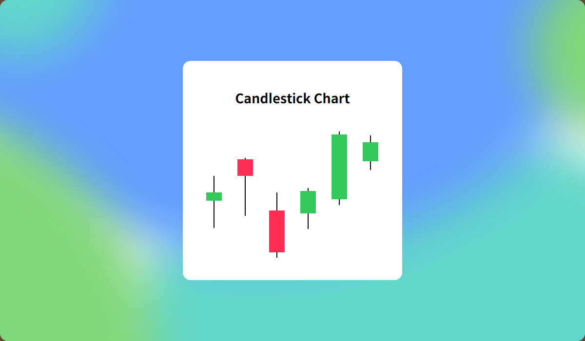
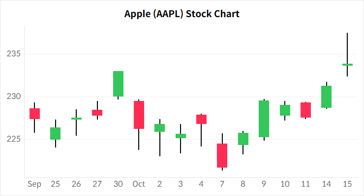
Candlestick chart is an effective tool for analyzing stock price trends. It provides four key indicators for a given period: the opening price, closing price, highest price, and lowest price. The color of the bar represents whether the price increased or decreased during that period.
In this article, we’ll use Apple stock data from the Nasdaq to build a candlestick chart.
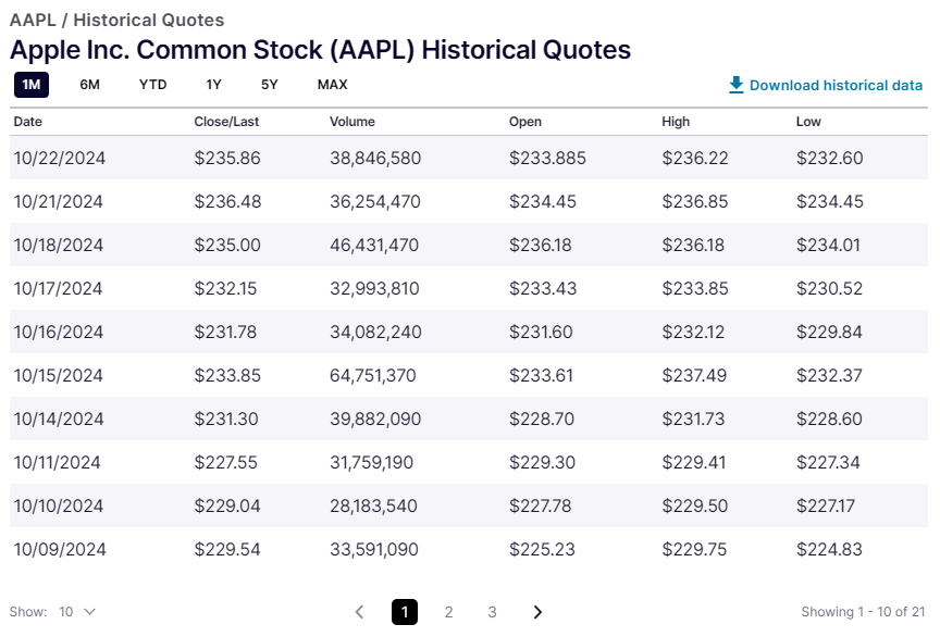
Step-by-Step: Creating a Candlestick Chart
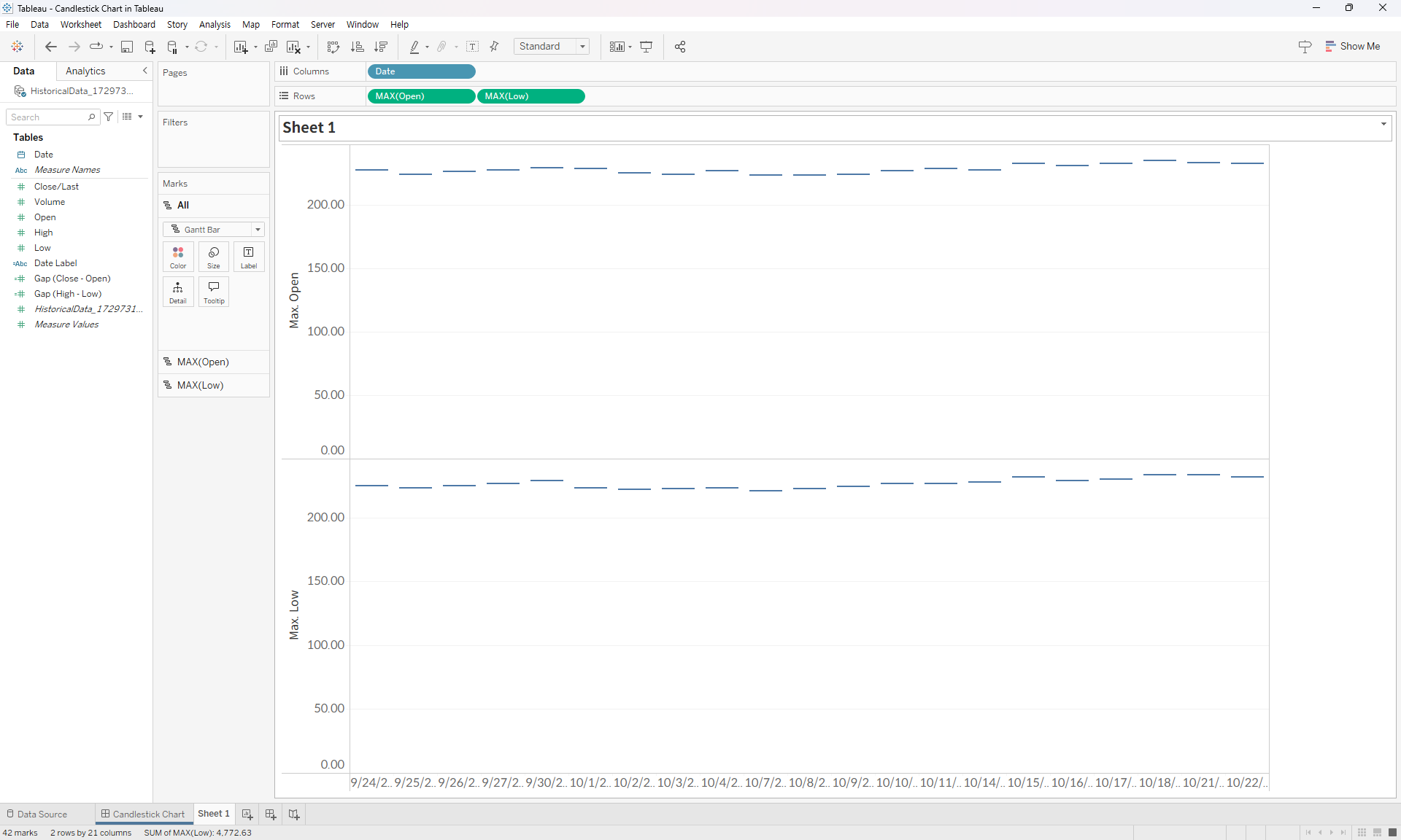
A candlestick chart in Tableau is created by overlaying two Gantt charts on dual axis: a thick bar representing the difference between the opening and closing prices, and a thin bar representing the difference between the low and high prices.
- Create a new sheet, place the Date field on the Columns shelf, and add both the Open and Low fields to the Rows shelf. Set the Mark type for both to Gantt Bar. For stock data, as it may not be available daily, set the Date field to discrete to prevent gaps where data is missing.
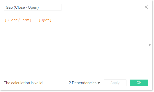
- Create calculated fields to determine the differences between the open and close prices and the high and low prices.
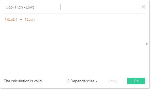
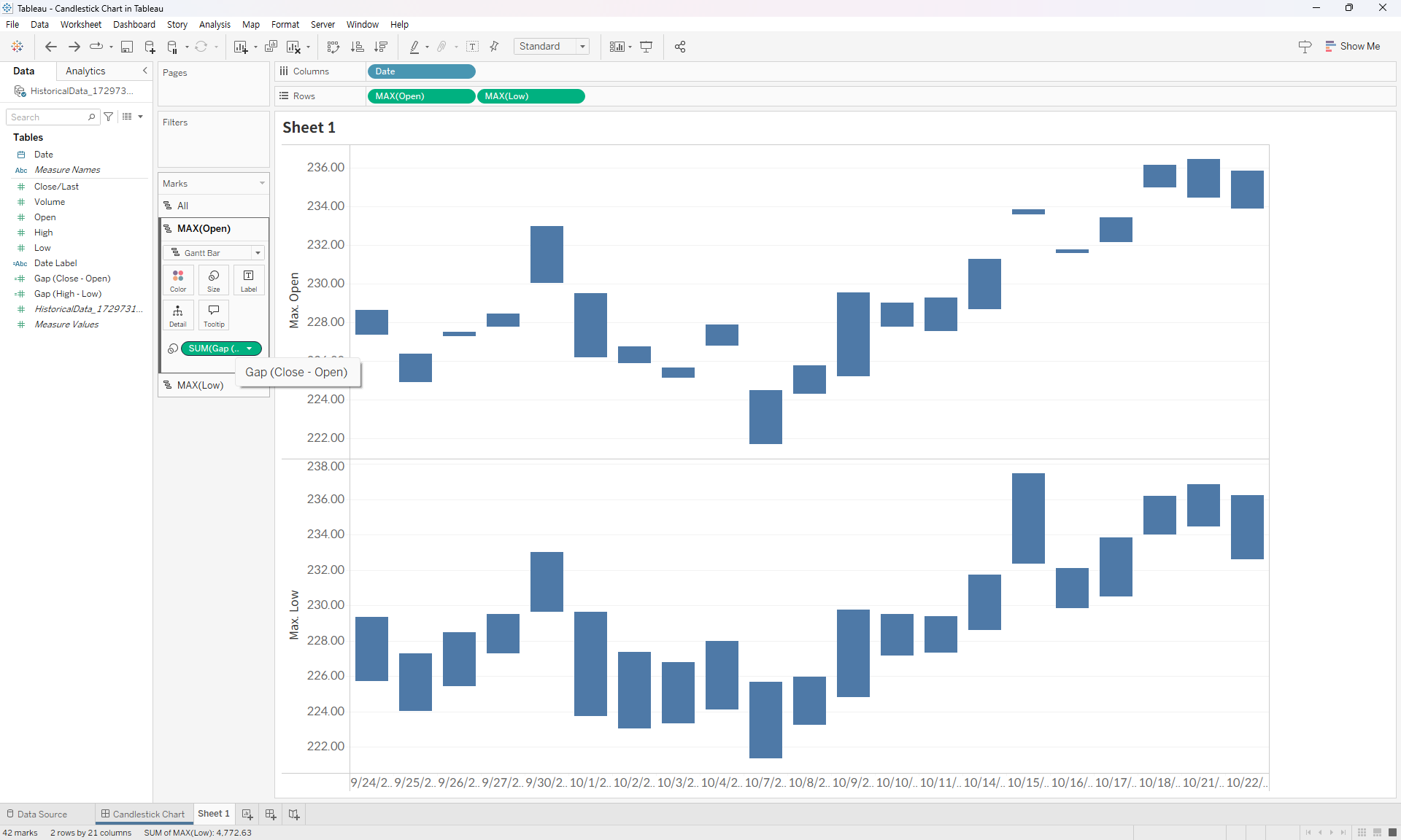
- In the Gantt chart representing the opening price, place the calculated field showing the difference between the open and close prices on the Size. In the Gantt chart representing the low price, place the calculated field showing the difference between the high and low prices on the Size. Uncheck the option to include zero in both axis.
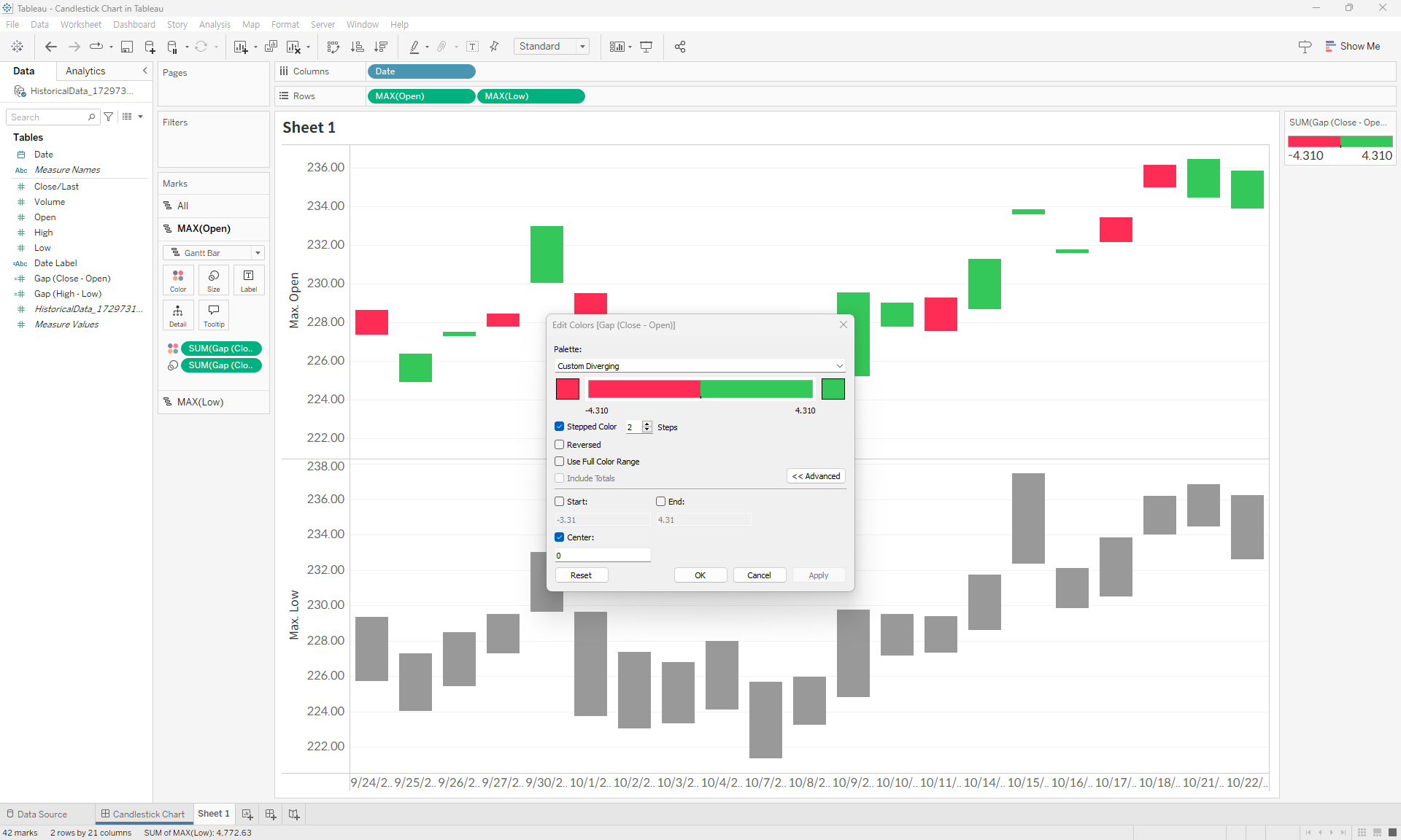
- In the open price chart section, add the field representing the difference between the open and close prices to the Color and set it to reflect positive and negative values (±) based on a zero baseline. Positive values indicate that the closing price is higher than the opening price, signaling a price increase.
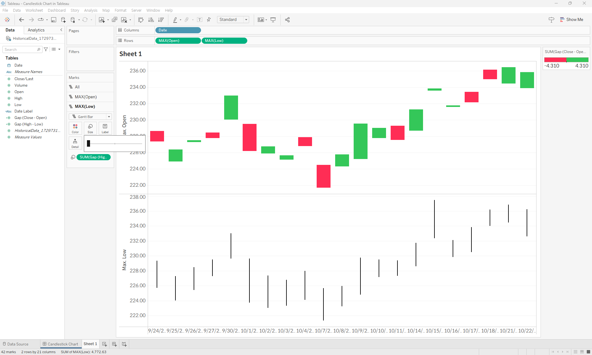
- Set the Color for the low price chart section to black and adjust the Size to the smallest setting.
- Set up Dual Axis on the Rows shelf for the Open and Low fields, Synchronize Axis, and ensure that the Open field appears in the foreground.
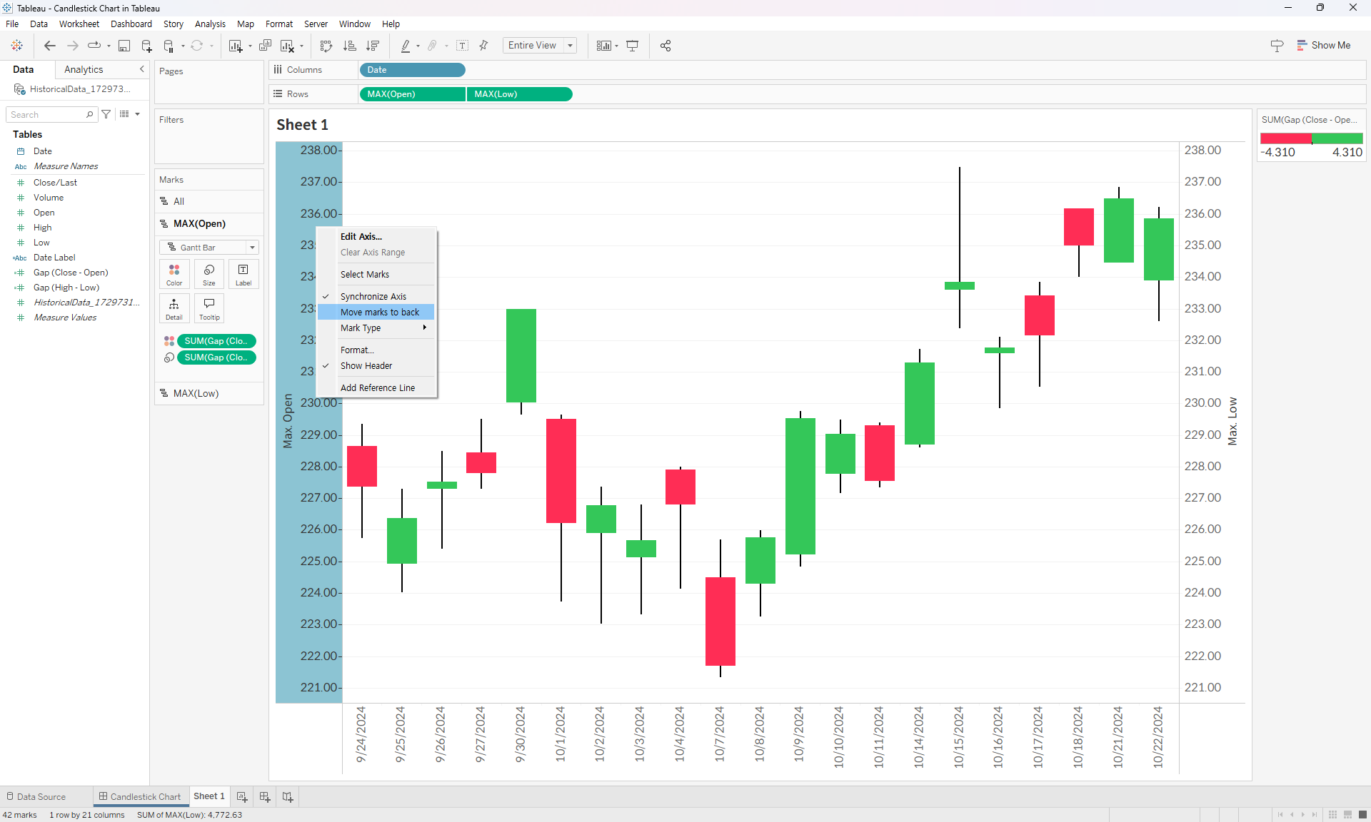
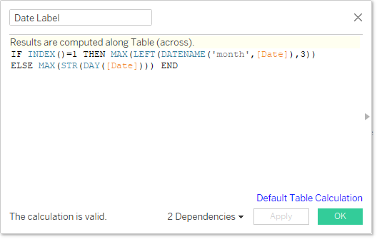
- Adjust header display, border formatting, and date formatting. For this example, the date axis is set to display the first date of each month with the corresponding month name for clarity.
- Complete the chart.
For more details, you can download and review the Tableau file below.
