How to Create Donut Chart in Tableau
Here’s how to create a donut chart, which is a variation of a pie chart.
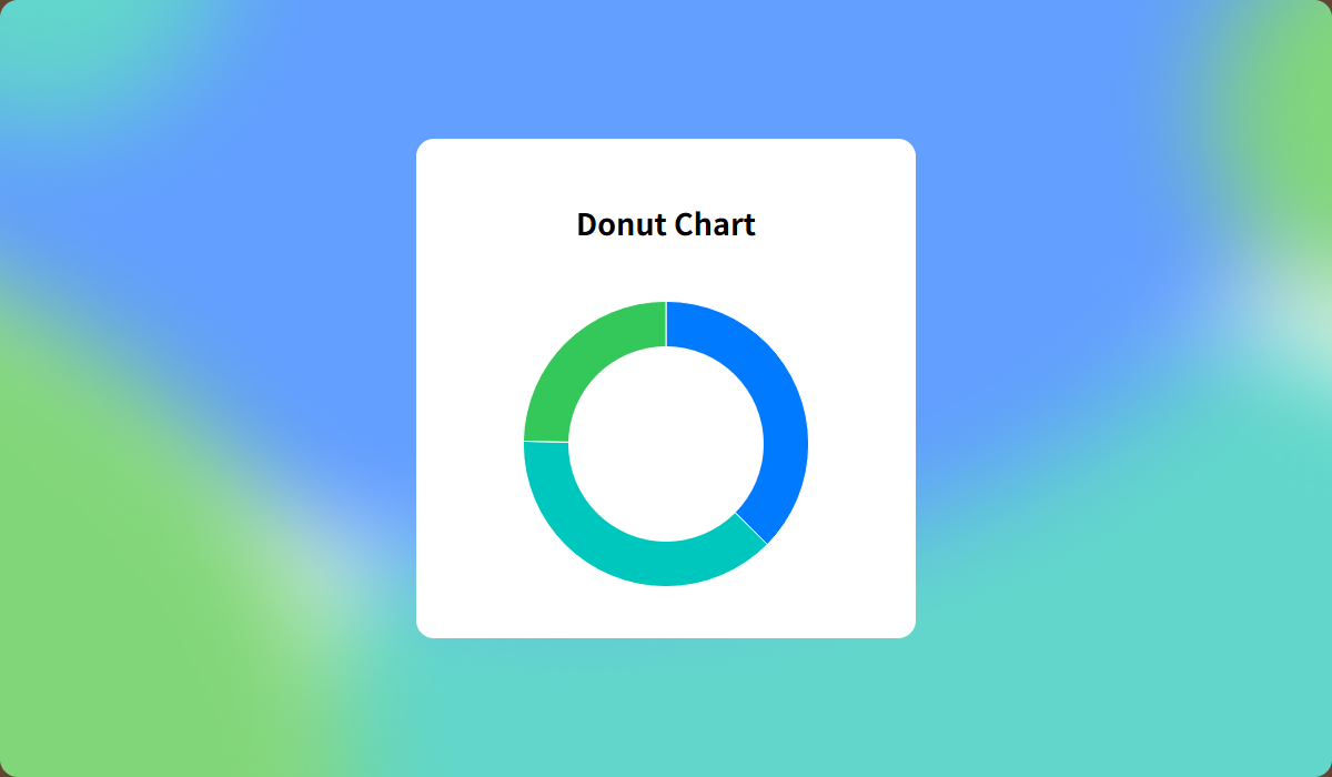
Donut chart is a variation of a pie chart that helps reduce color fatigue and improves space efficiency by allowing you to add totals or legends in the center of the chart. It's a popular choice among users, often preferred over traditional pie charts for these reasons.
Here’s a step-by-step guide on how to create a donut chart in Tableau.
Method 1: Using Dual Axis
In this method, you’ll use a dual axis to overlay a smaller white circle on top of a pie chart, creating the donut effect.
- Start by creating a basic pie chart.
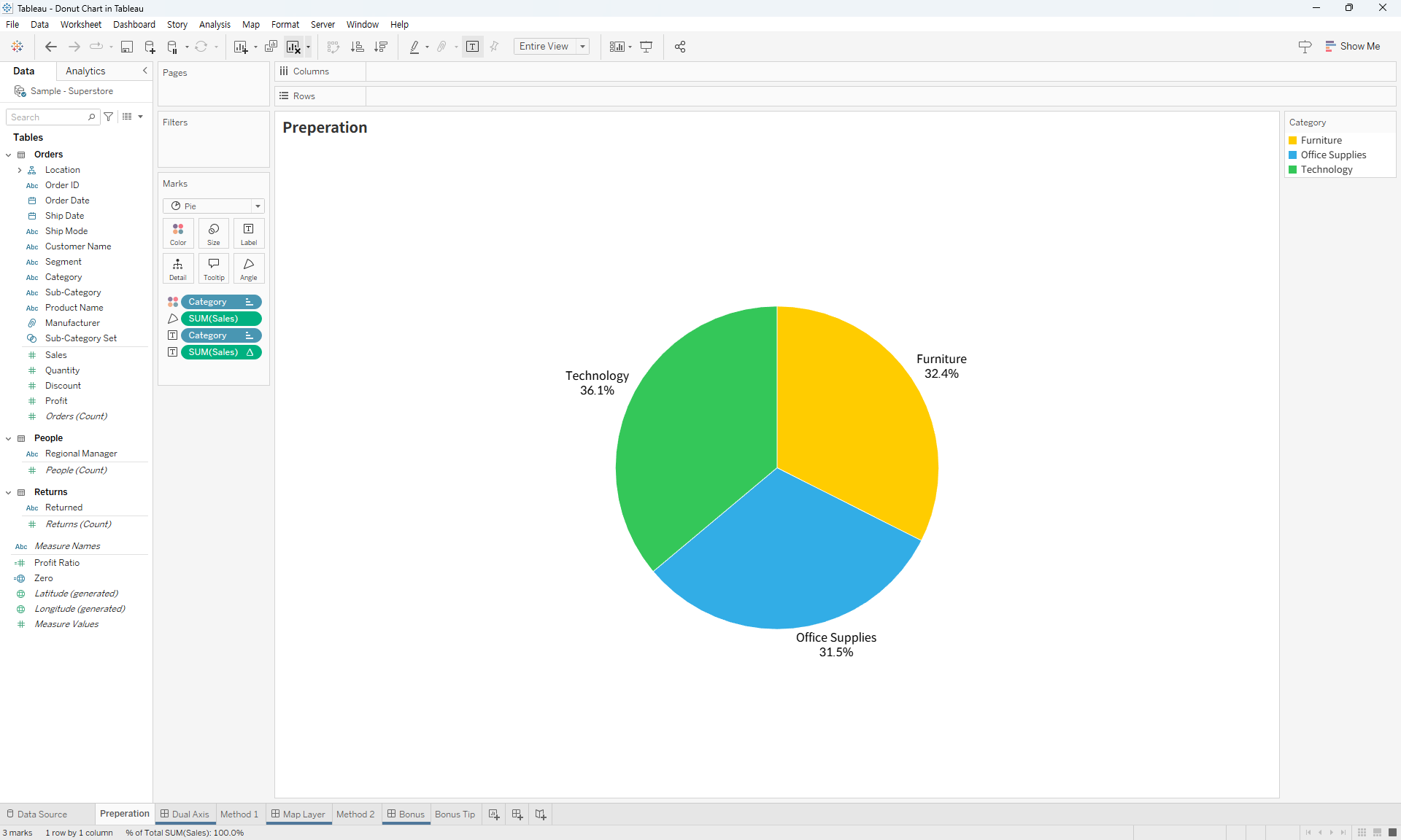
- Create two instances of an arbitrary
0field and place them on the Columns shelf.
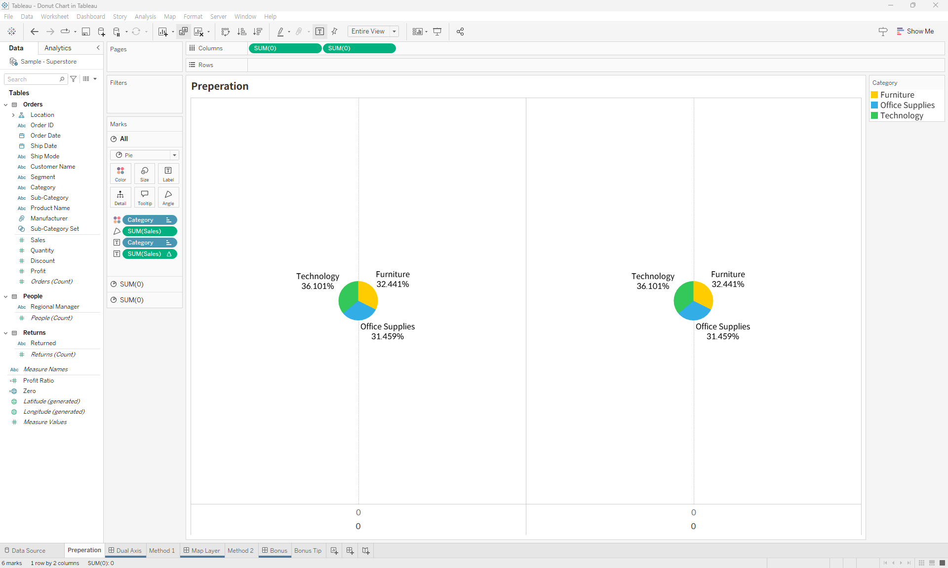
- For the second instance of
0, remove all elements except the mark type and set it to Circle. - Change the color of the circle to white and adjust its size to be slightly smaller than the pie chart.
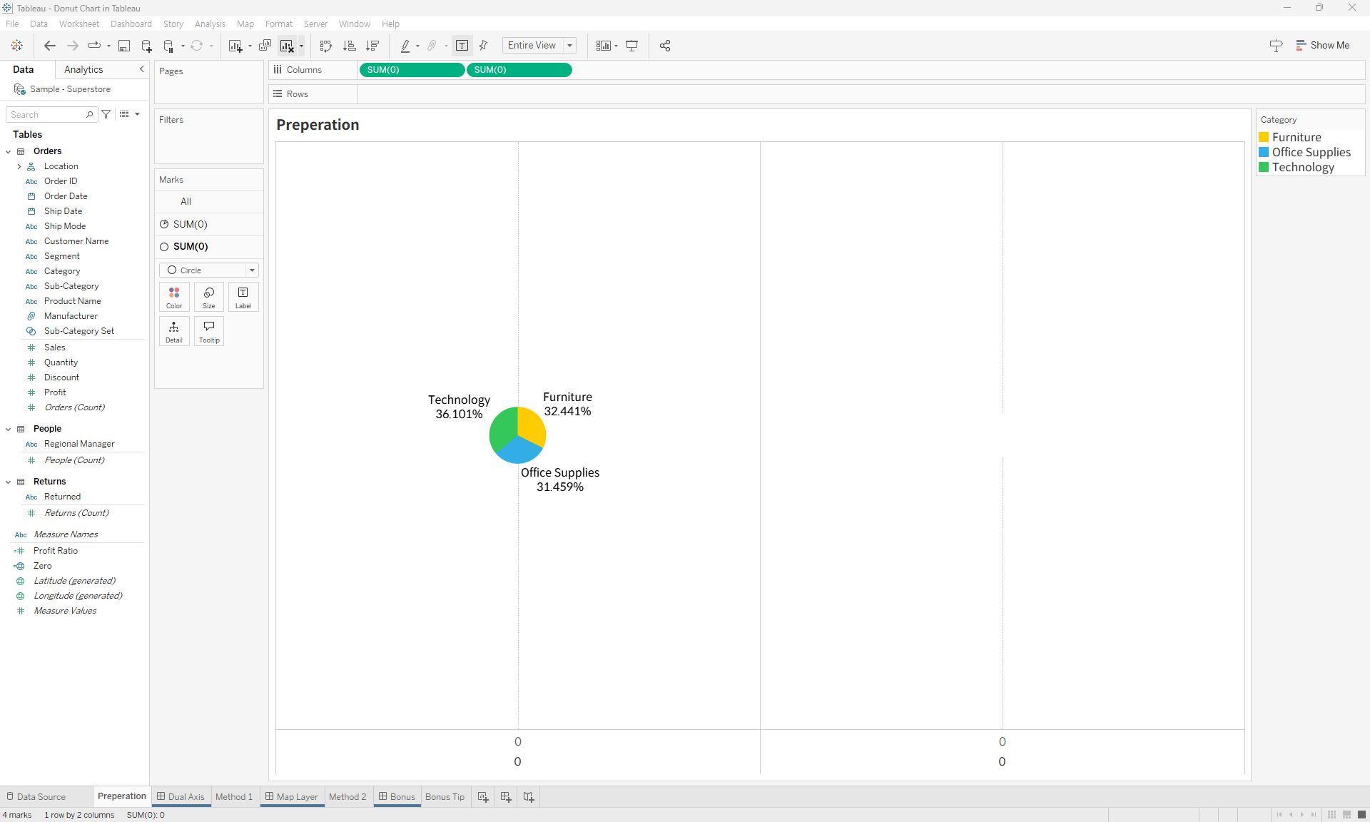
- Right-click the second
0axis and select Dual Axis.
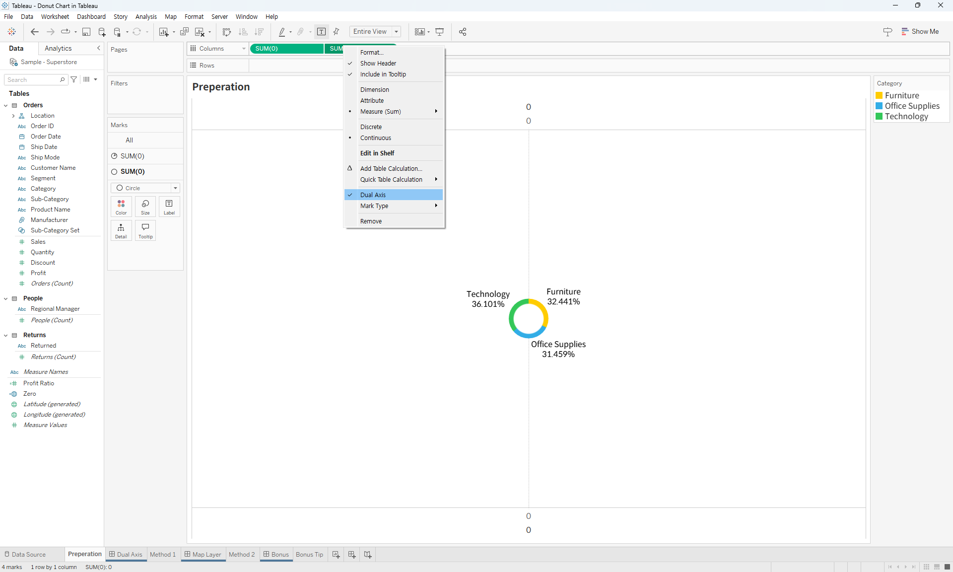
- Adjust the size, formatting, and headers as needed. Adding a white border to the pie chart can help visually separate the segments.
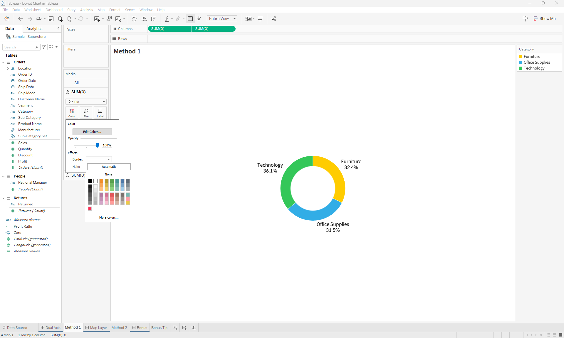
- Now, your donut chart is complete.
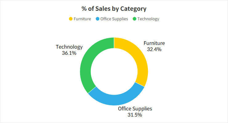
Method 2: Using the Layering Feature in Maps
This method uses Tableau’s map layering feature to overlay a smaller white circle on top of a pie chart, giving it a donut appearance.
- Start by creating a basic pie chart.

- Use the
MAKEPOINTfunction to create a field with both latitude and longitude set to0(let's call itZero).

- Double-click the
Zerofield to automatically generate latitude and longitude on the Rows and Columns shelves.
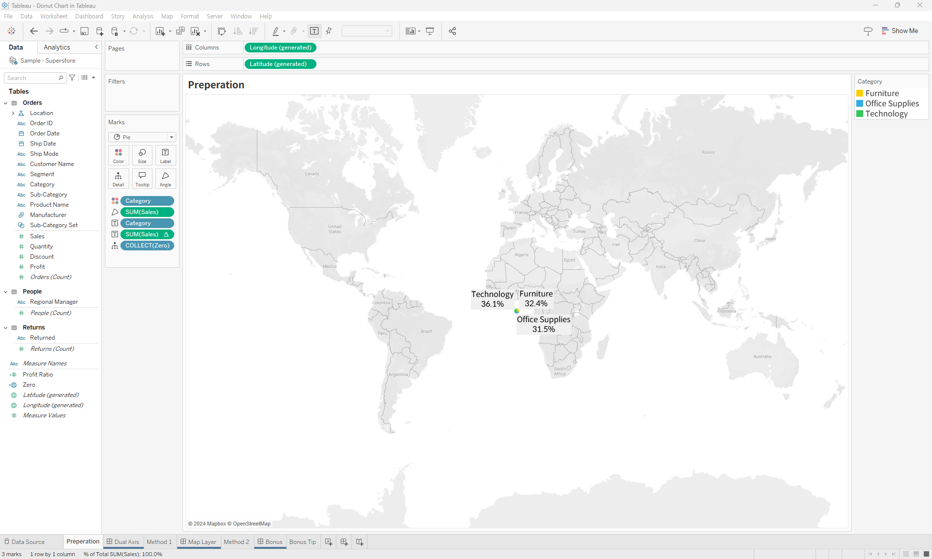
- Drag the
Zerofield to the Marks card and select Add to Layer.
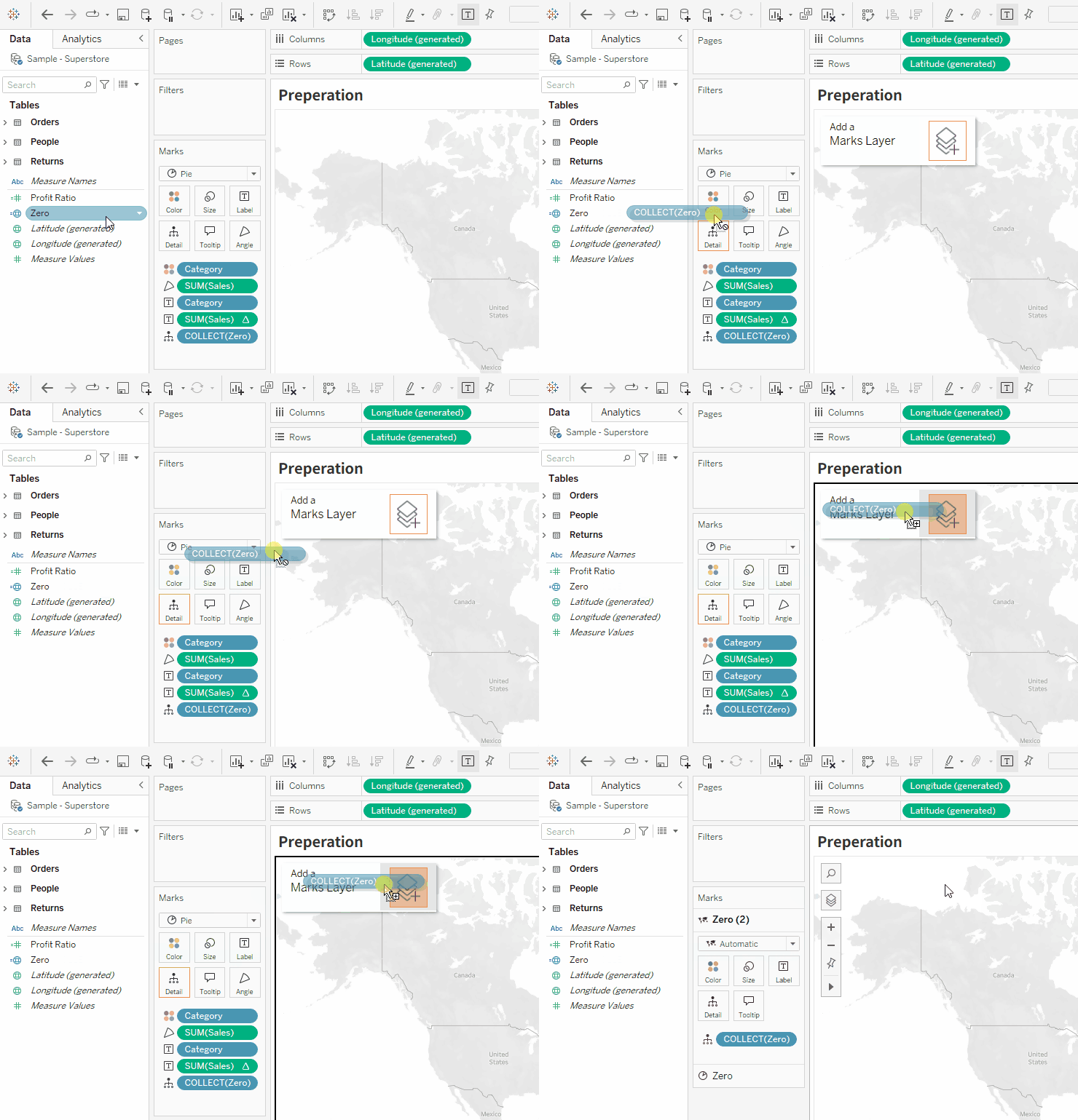
- Remove the latitude and longitude fields from the Rows and Columns shelves.
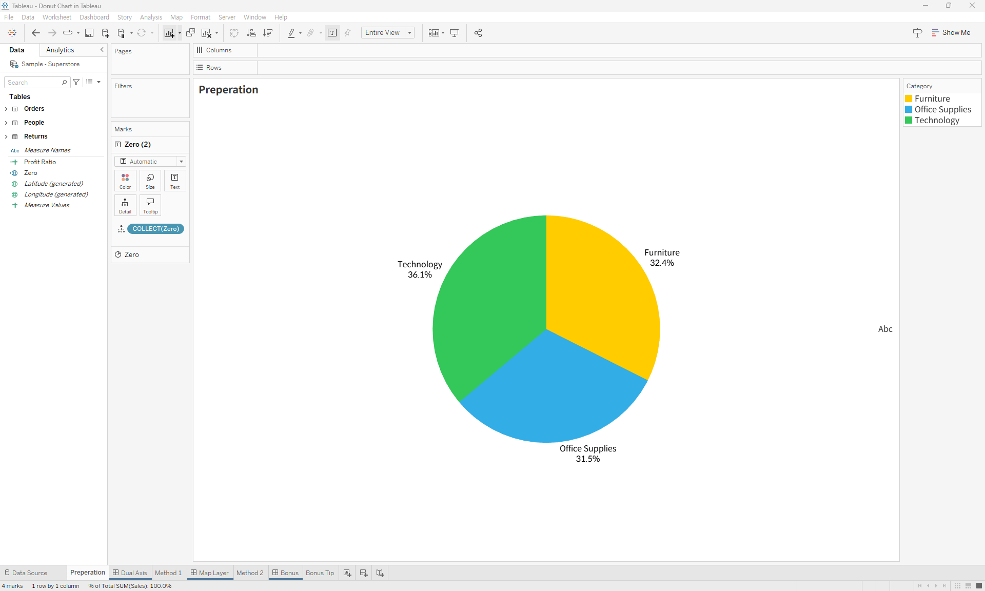
- Change the second mark (representing the
Zerofield) to a Circle, set its color to white, and adjust the size to be slightly smaller than the pie chart.
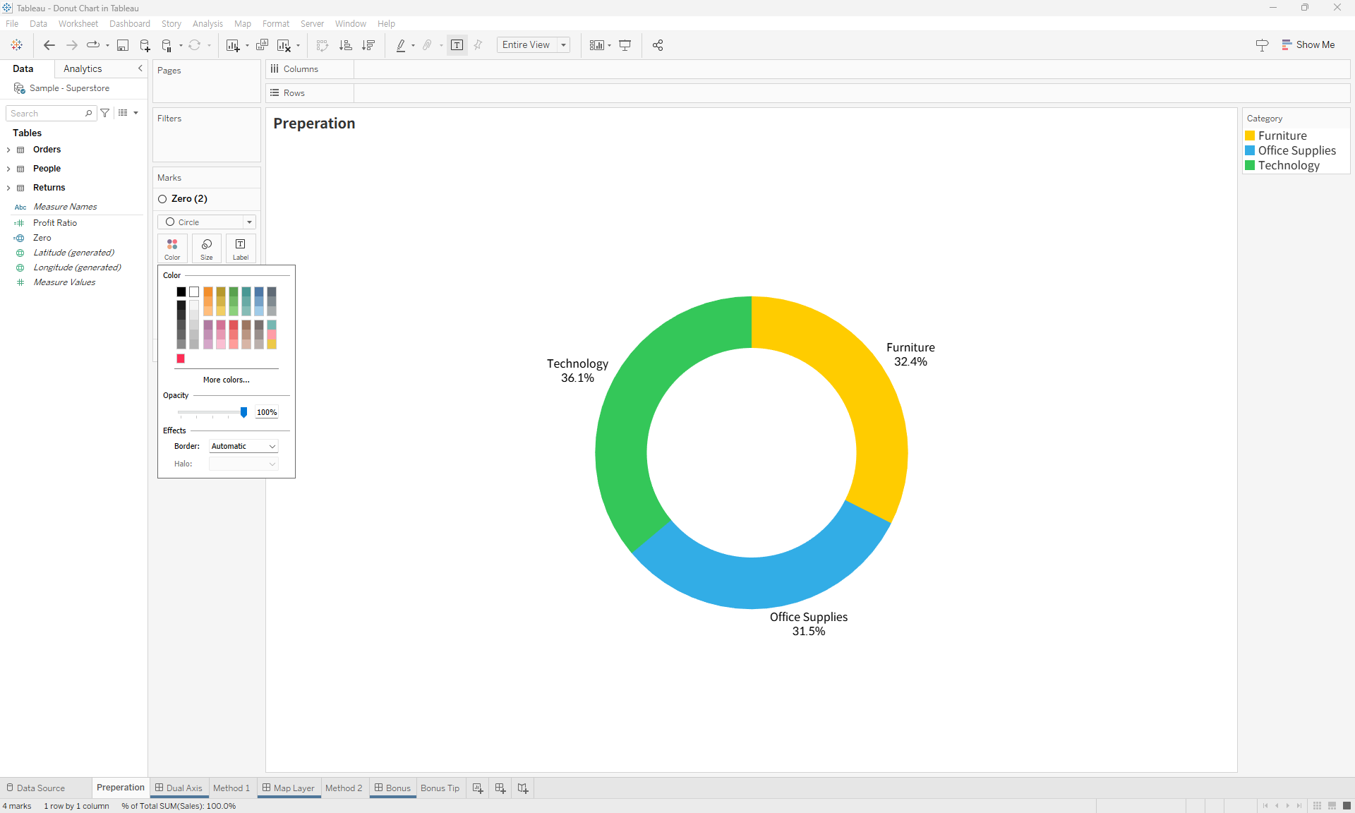
- Your donut chart is done!
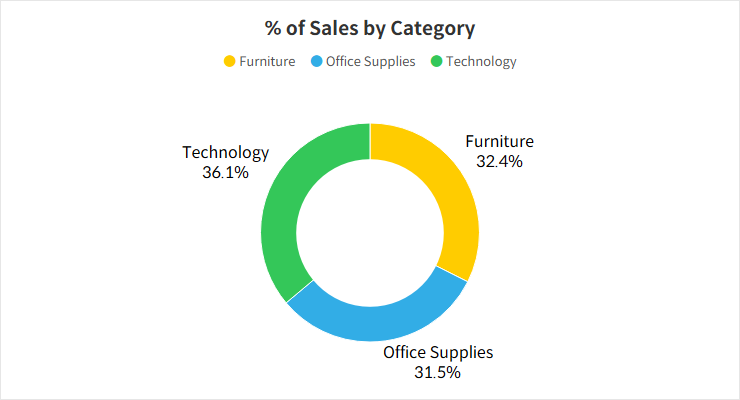
Bonus Tip: Multi-Layering
The layering method can be extended to overlay multiple pie charts, allowing you to create more advanced and visually interesting chart combinations. You can add more than two layers for creative variations of pie and donut charts.
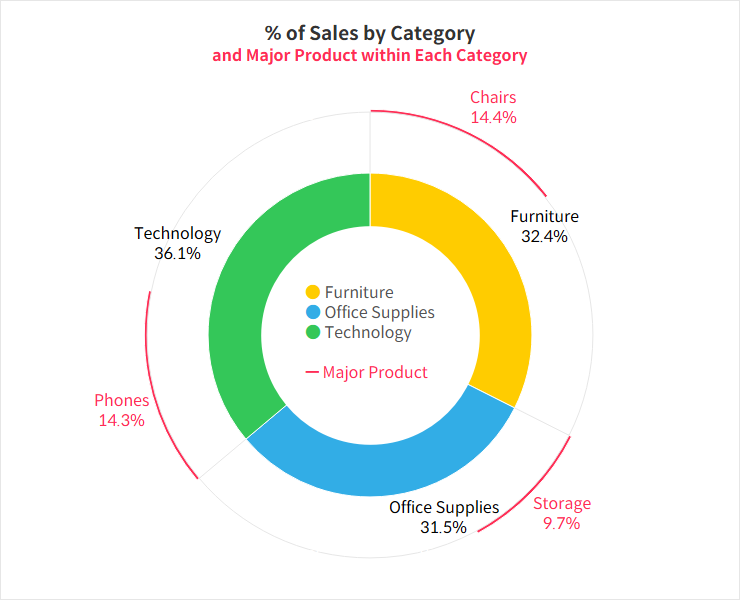
For more details, you can download and review the Tableau file below.

