How to Create Funnel Chart in Tableau
A guide on how to create a funnel chart, which is useful for visualizing step-by-step reductions in a process.

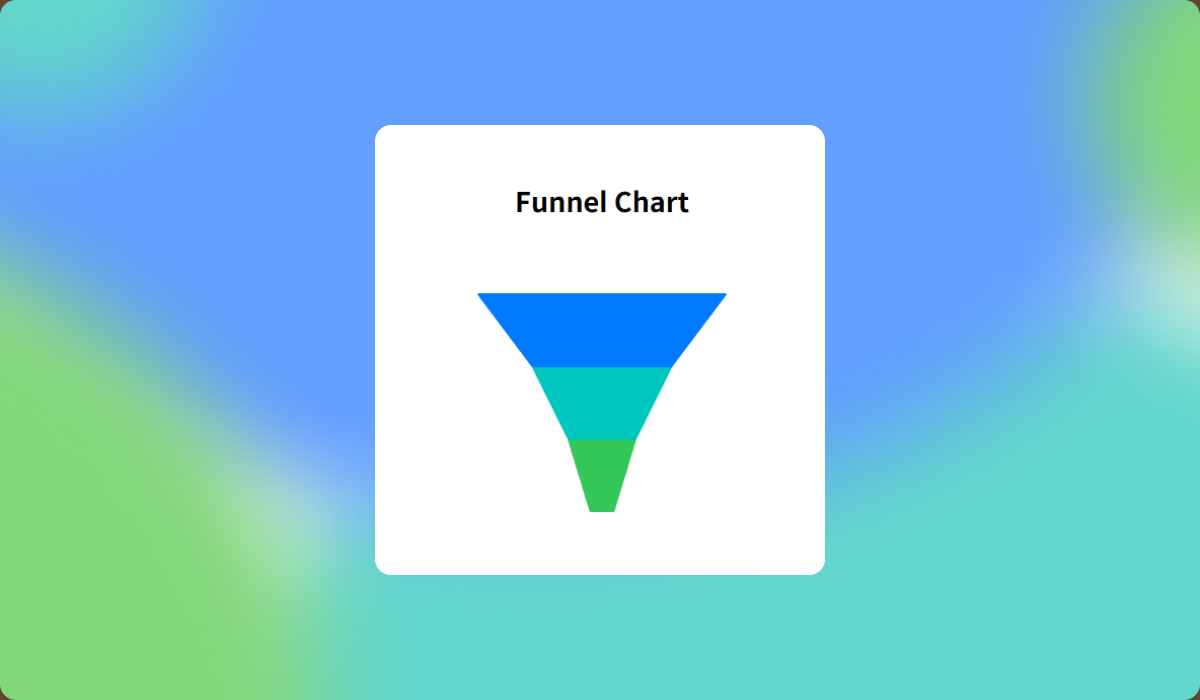
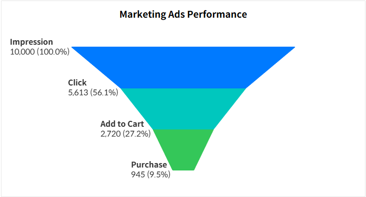
Funnel chart is a visually intuitive way to display data that progresses through stages, often used in sales and marketing analytics. Unlike traditional charts that display values from a zero baseline, funnel charts extend values symmetrically on both sides, making it harder to gauge exact magnitudes. Therefore, it's essential to incorporate labels or additional grid charts to provide clear value representation.
In this guide, we’ll explore two methods for creating a funnel chart using sample advertising data:
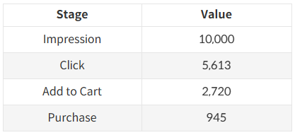
- A basic funnel chart using bar charts.
- An advanced funnel chart using area charts to achieve a true funnel shape.
Step-by-Step: Basic Funnel Chart
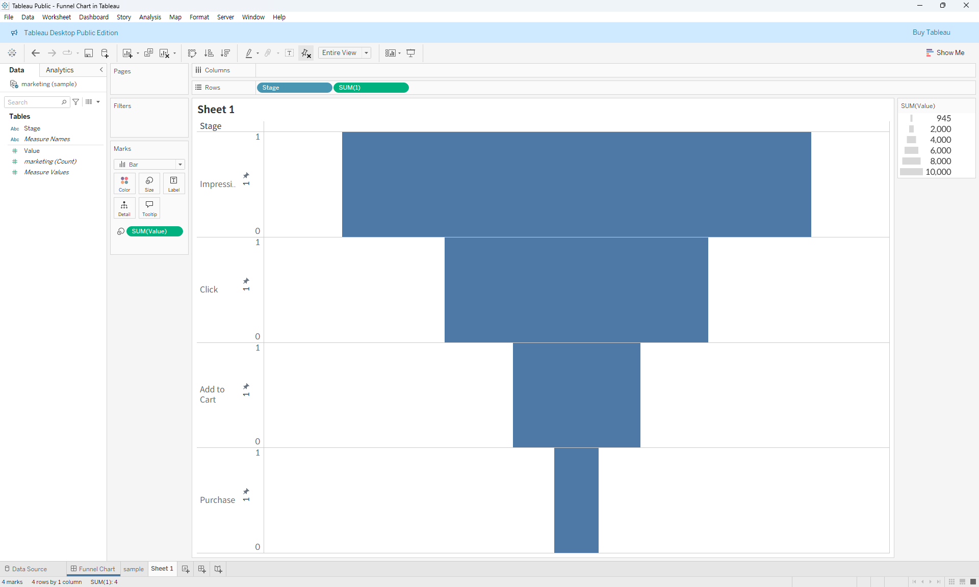
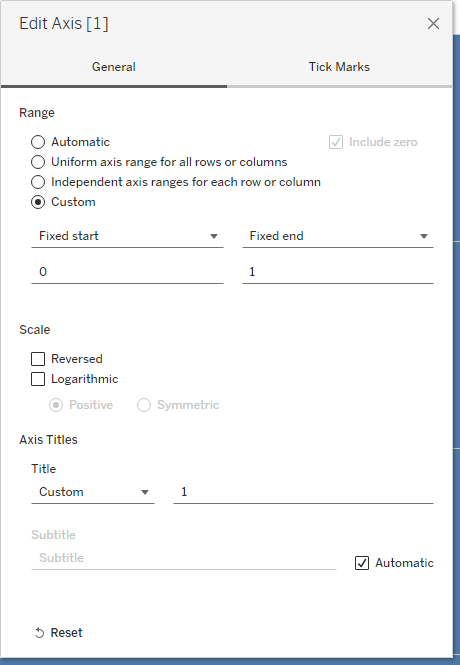
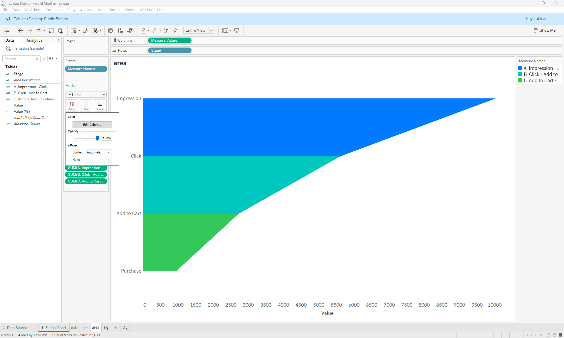
- Drag the Stage field to the Rows shelf and create a calculated field with a constant value of 1. Place this field on the Rows shelf and set its axis to range from 0 to 1, ensuring a full-height representation. Add the Value field to the Size shelf.
- Adjust the formatting and labels to enhance readability. Adding percentage labels helps users understand the proportions.
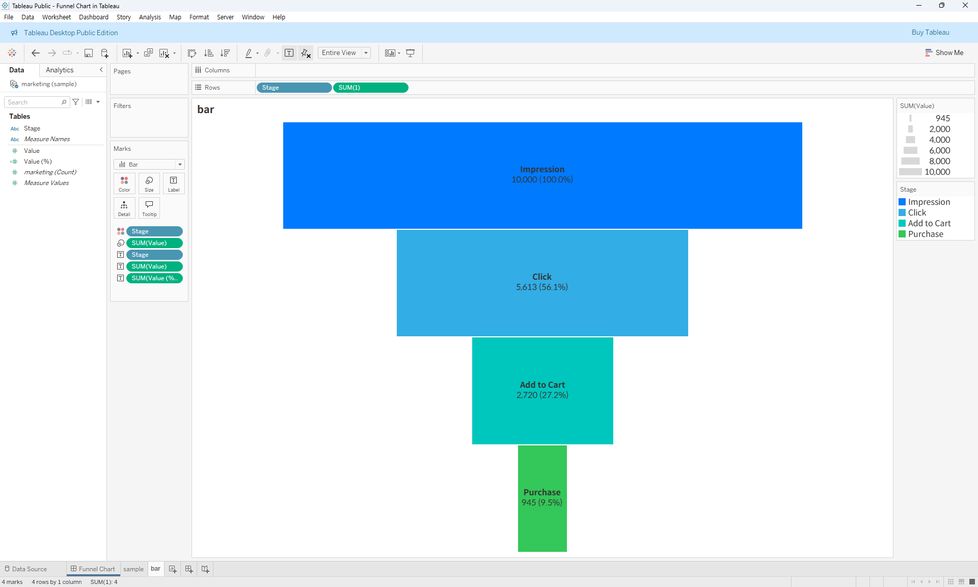
- Finalize the chart.
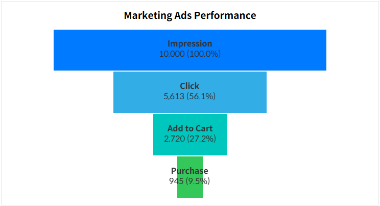
Step-by-Step: Advanced Funnel Chart
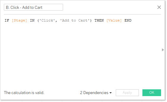
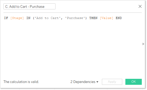
- When using area charts to create a funnel shape, a challenge arises: it’s difficult to differentiate between stages.
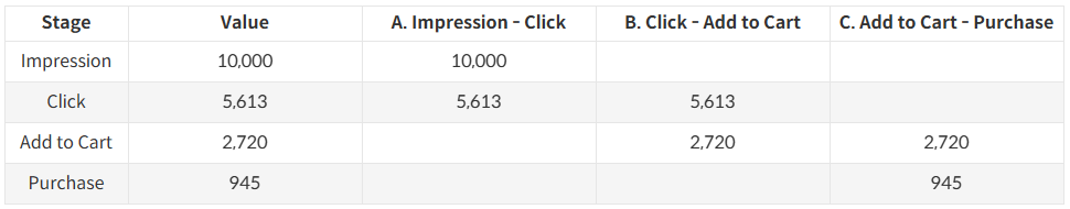
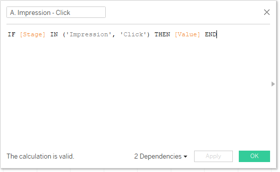
To overcome this, we need to create separate measures for each stage transition using an IF statement.
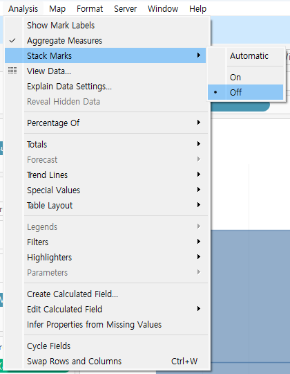
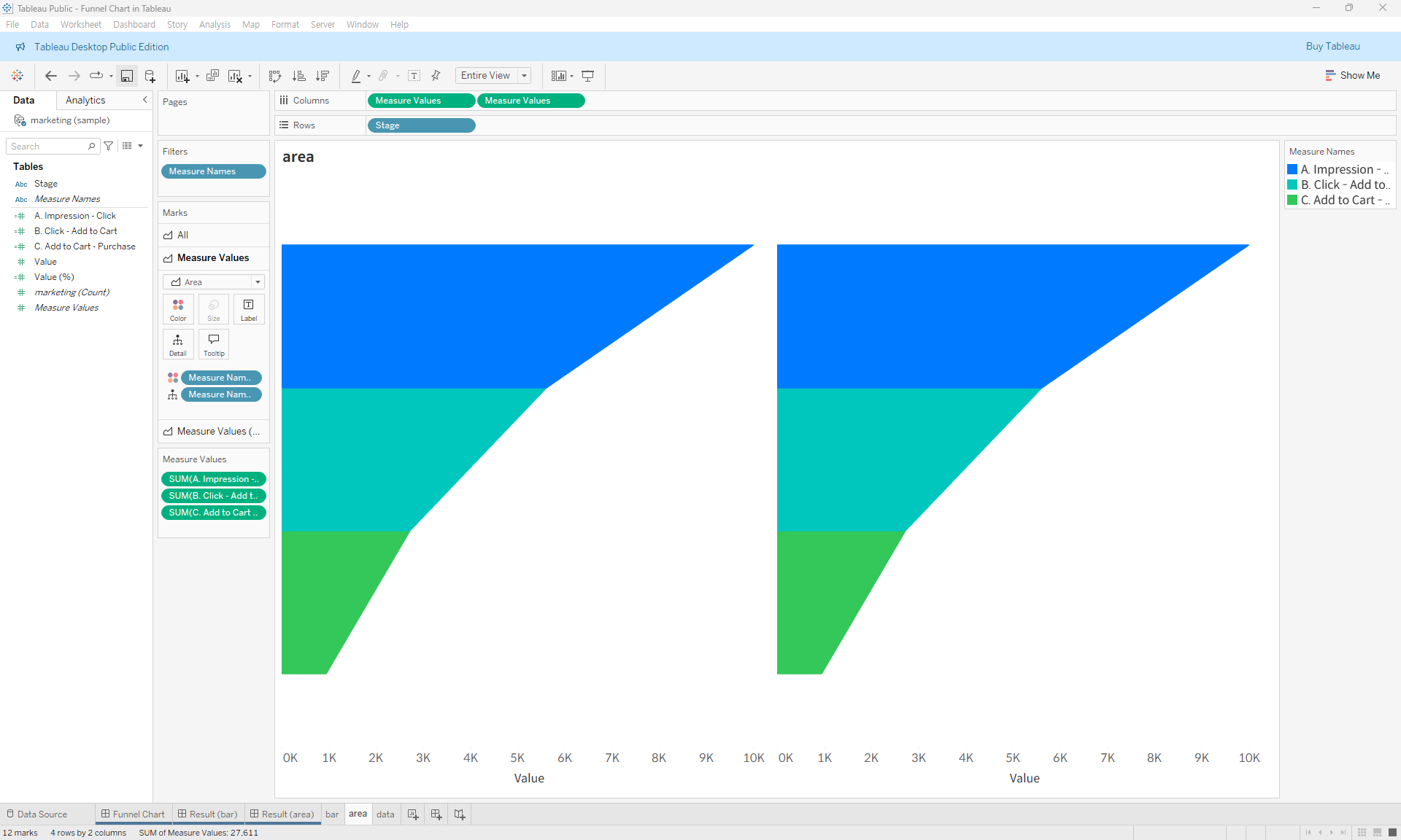
- Use the calculated fields to build an area chart and disable mark stacking.
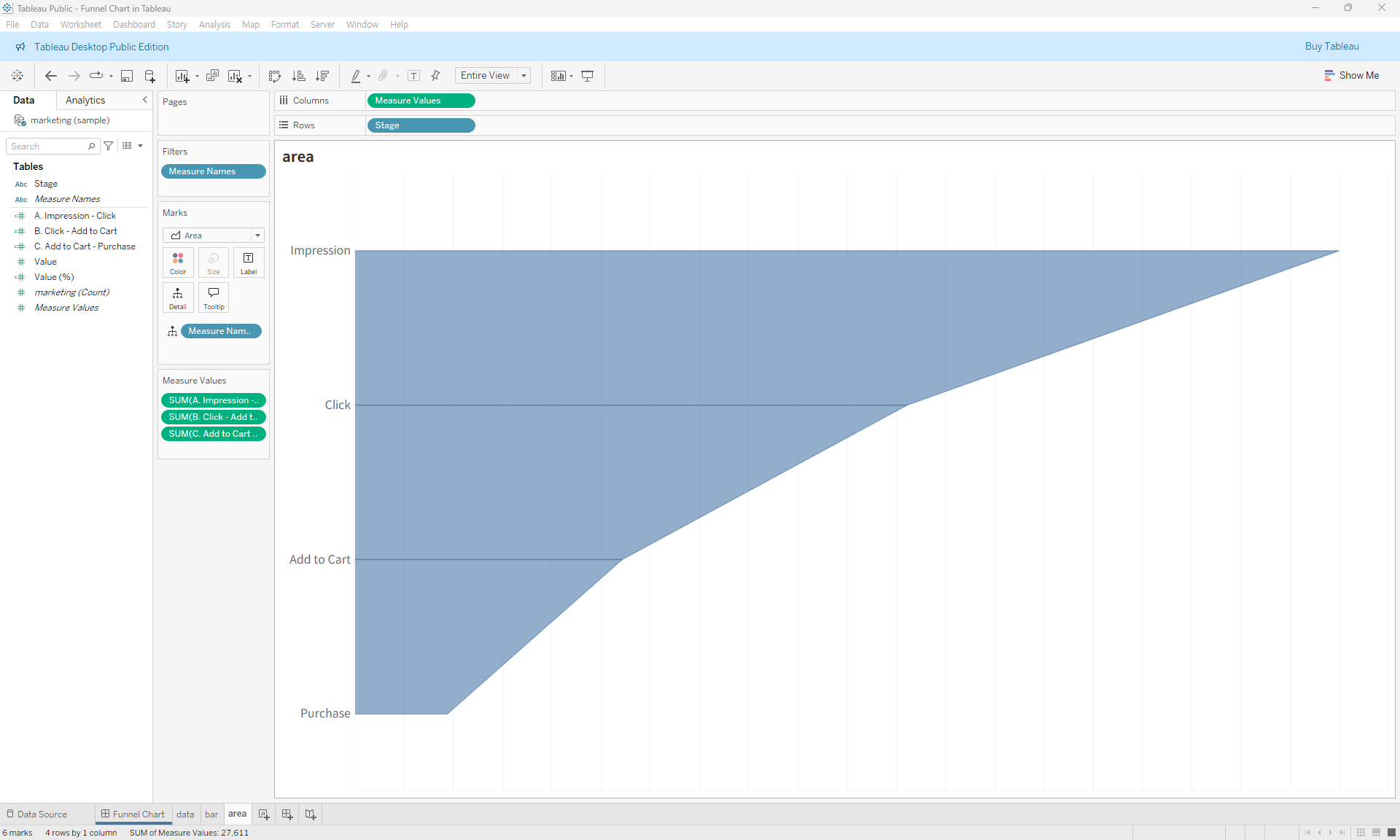
- Add the Measure Names field to the Color shelf and set transparency to 100%.
- Duplicate the measure values in the Columns shelf by holding Ctrl and dragging.
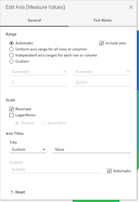
- Reverse the axis of the left-side measure.
- Add labels using the Stage and Value fields instead of Measure Names and Measure Values. Adding invisible reference lines on both sides can improve label alignment.
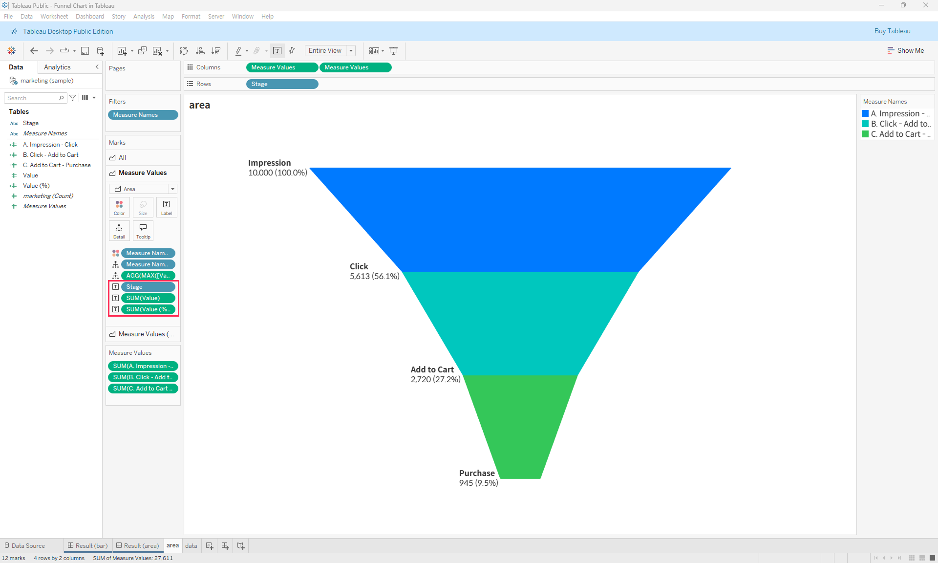
- Finalize the chart.
You can download the Tableau file below for more details.