Using Pie Chart in Tableau
In this post, we'll look at how to use pie charts more effectively in Tableau and some key considerations to keep in mind.
Pie Charts for Showing Proportions
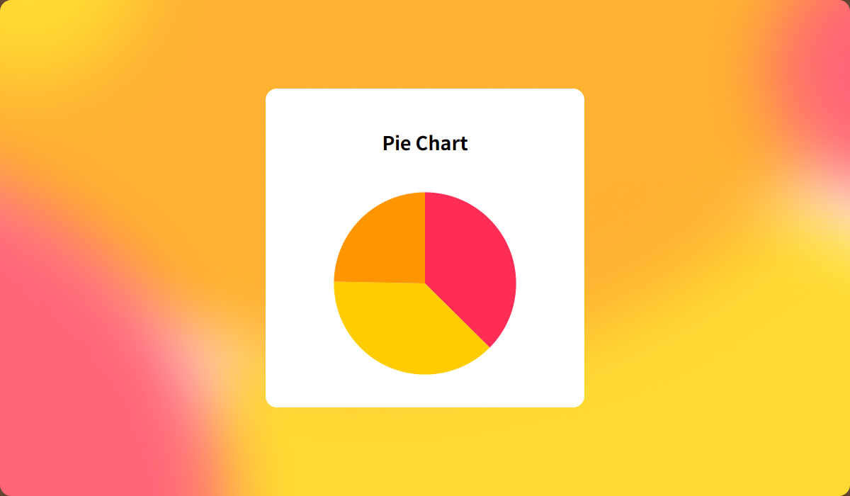
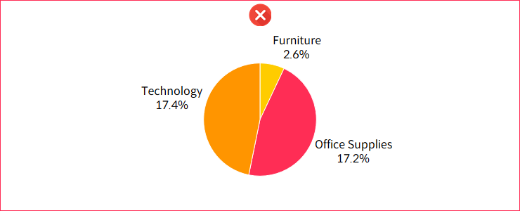
The main purpose of a pie chart is to show how different segments compare to the whole. It’s best used when the total equals 100%. If you're working with data where the total doesn't add up to 100%—or if there are negative values, like profit or loss—pie charts aren’t the right choice. In these cases, consider using a different chart type to better represent the data.
Donut Charts: A Better Alternative
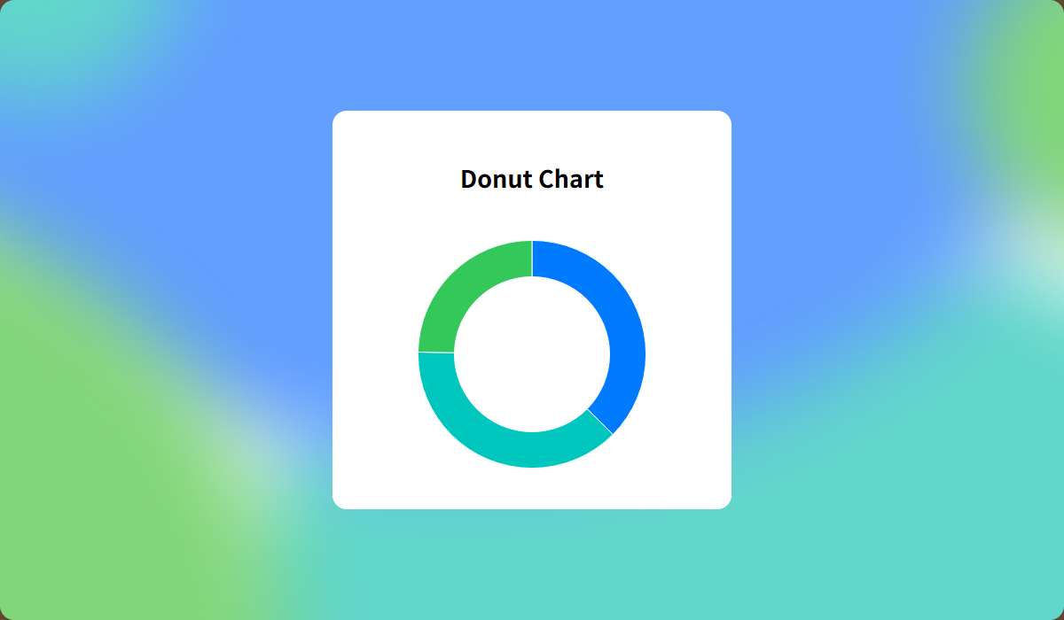
Although Tableau provides pie charts by default, donut charts are often preferred in practice. They offer the same visualization of proportions but with added advantages. The center space can be used to display total values, and the reduced color intensity creates a cleaner, more visually appealing design.
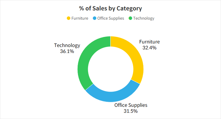
If you'd like to learn how to create donut charts, check out our guide on two methods for building them in Tableau.
Use Grid Charts as a Backup
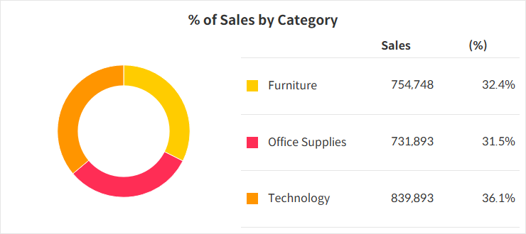
When using pie charts, smaller segments can sometimes get lost, especially if the chart is resized. To avoid this, consider using a grid chart alongside the pie chart to ensure that all values are visible. While the proportions might be clear with your current data, future changes could lead to some segments becoming too small to see. Always keep in mind that the data distribution may change over time.
Keep the Number of Categories Manageable
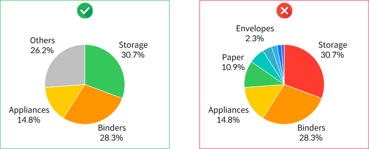
If your pie chart has too many categories, it can become hard to read. A good approach is to show the top 3 categories and group the rest as “Others.” If you must display all categories, it’s worth exploring other chart types that handle larger datasets more effectively.
