Using Scatter Chart in Tableau
Scatter charts are a great way to visualize the distribution of data points. In this post, we’ll explore how to use them more effectively and highlight key considerations to keep in mind.
Understanding Scatter Charts as a Distribution Tool
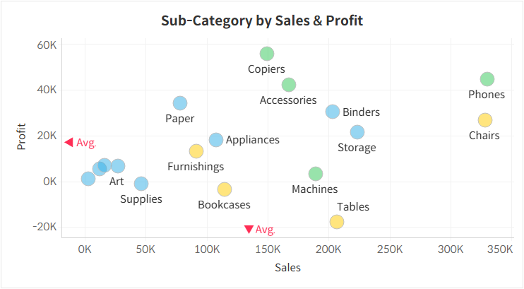
Scatter charts plot data points based on two measures, one on the horizontal axis and the other on the vertical axis. They are particularly useful for identifying relationships between the two measures rather than focusing on individual values. Because of this, scatter charts work best in dashboards that provide summarized insights or when paired with more detailed visualizations.
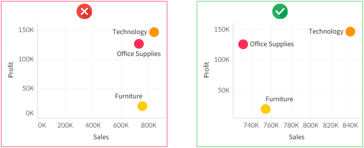
Disabling Zero Inclusion for Better Visibility
Unlike bar charts, which emphasize individual values, scatter charts are meant to compare data points. To maximize clarity, it’s best to disable the "Include Zero" option, allowing the data to be distributed more effectively across the available space.
Adjusting Transparency to Handle Overlapping Points
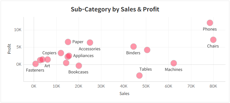
Since scatter charts position data points based on two measures, their locations can be unpredictable. As a result, overlapping points are common, making it difficult to distinguish individual values. Adjusting transparency helps mitigate this issue, while adding borders improves visibility and ensures clarity.
Managing Outliers That Skew Comparisons
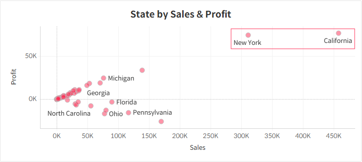
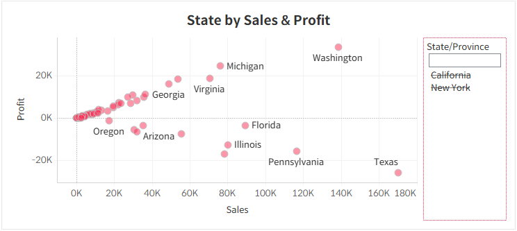
Outliers with extremely high values can compress the majority of data points into a small area, making comparisons less meaningful. In such cases, excluding outliers can enhance readability and improve the overall effectiveness of the chart. However, it’s important to clearly indicate any exclusions to prevent misinterpretation or misleading analysis.
Using Reference Lines to Enhance Data Interpretation
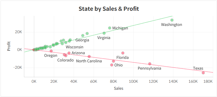
If a clear trend emerges in the data, adding a trend line can help users better understand the pattern. However, since trend lines don’t automatically adjust to different contexts, they should only be used when truly relevant. Additionally, reference lines should be subtle, serving as a guide rather than dominating the visualization—adjusting their transparency can help maintain balance.
One of the most commonly used reference lines in scatter charts is the average line. If a line format isn’t ideal for your data, check out our related post for alternative visualization techniques.
