CO2 Emissions
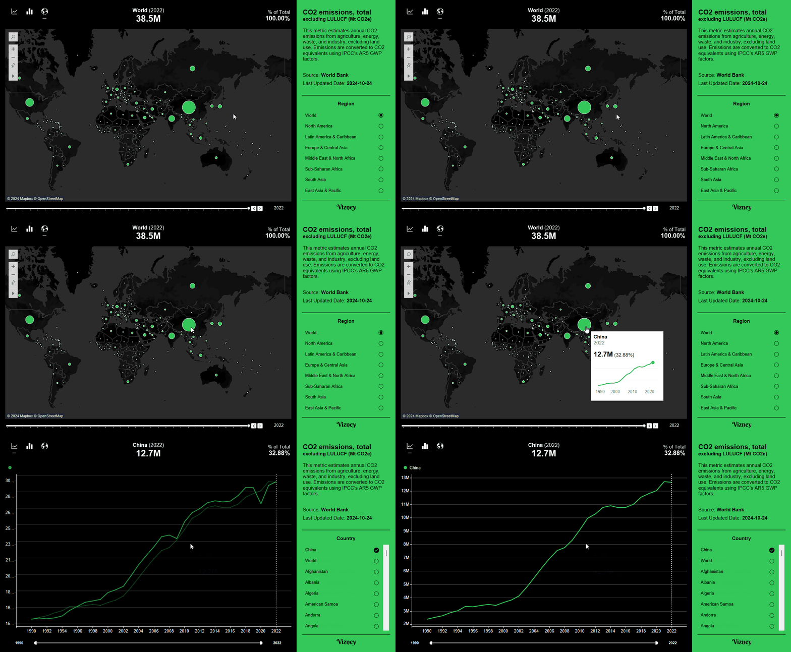
This dashboard shows CO2 emissions by year.
Definition
A measure of annual emissions of carbon dioxide (CO2), one of the six Kyoto greenhouse gases (GHG), from the agriculture, energy, waste, and industrial sectors, excluding LULUCF.. The measure is standardized to carbon dioxide equivalent values using the Global Warming Potential (GWP) factors of IPCC's 5th Assessment Report (AR5).
How to Use
- Line Chart
- View yearly trends globally, by country, or for a selected group(*).
- Compare trends across multiple countries (up to five) over time.
- Adjust the year range or select a specific year to focus on data for that period.
- Bar Chart
- Choose world or regional data to compare values across countries.
- Select a specific year to view data for that point in time.
- Hover over a country to see a quick view of its yearly trends.
- When one or multiple countries are selected, you can go to the line chart dashboard to view trends for the selected countries.
- Map Chart
- Choose world or regional data to compare country values by circle size.
- Select a specific year to focus on data for that point in time.
- Hover over a country to get a brief view of its yearly trends.
- When one or multiple countries are selected, you can go to the line chart dashboard to view trends for the selected countries.
Source
World Bank Open Data
Free and open access to global development data

Used Tips & Tricks
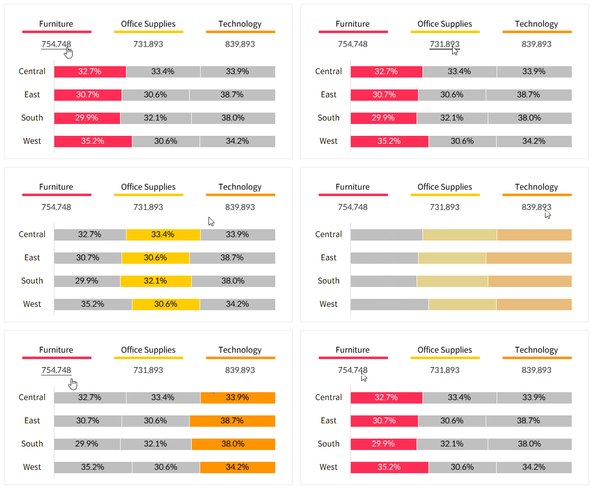
How to Create Parameter Buttons in Tableau
This approach helps improve the limited parameter UI, making it more intuitive and user-friendly.
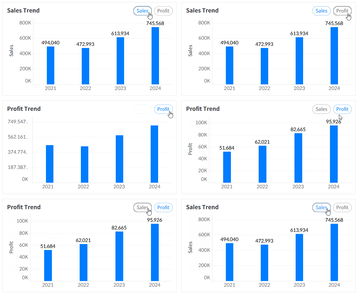
Multi-Select Parameters in Tableau
Here’s a method to enable multi-select functionality for parameters in Tableau, which by default only support single selection.
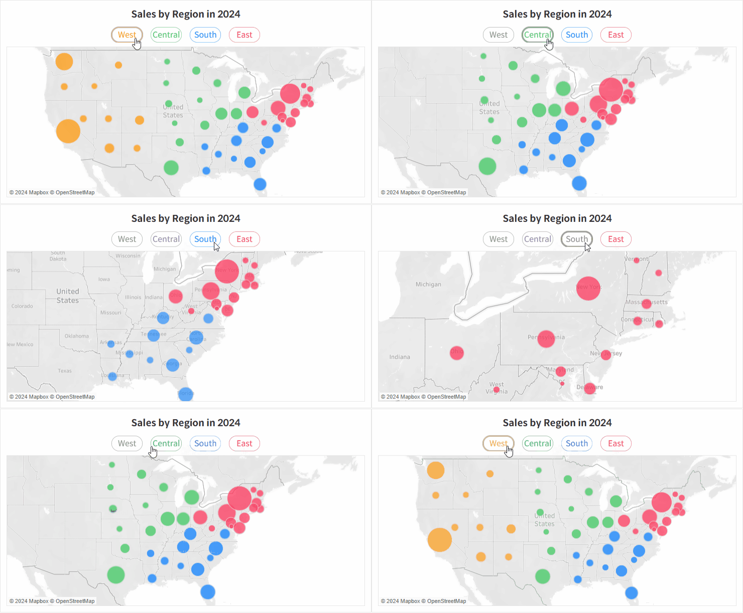
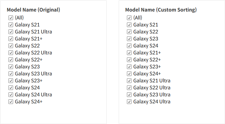
How to Specify Sort Order of Items in Tableau Quick Filters
Here’s a way to apply a custom sorting logic to a quick filter, beyond the default options of data source order, alphabetical order, and manual sorting.
How to Disable Selection Highlighting in Tableau
This is how you can prevent the blue shading highlight that appears when selecting a specific area on a dashboard for interaction.
