How to Create Waffle Chart in Tableau
This guide shows you how to create a waffle chart in Tableau—a useful visual for understanding what share a particular item holds in the overall market.

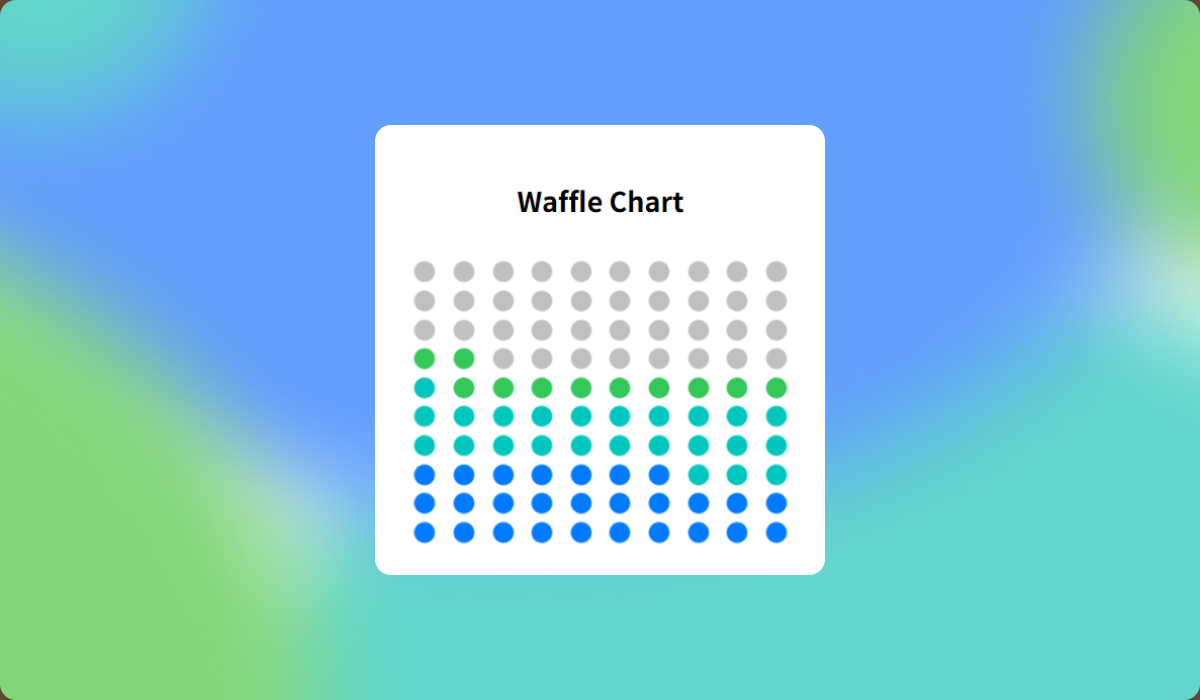
Waffle chart is a great way to visualize the percentage share of a specific item relative to a whole. They serve as an effective alternative to pie charts, especially when you want to highlight individual proportions. However, they're not ideal for displaying a large number of items at once, and due to limitations in visual accuracy, it's best to pair them with labels for precise values.
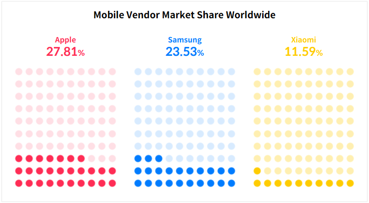
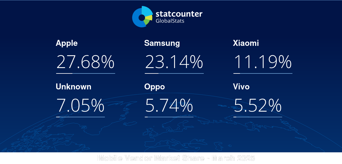
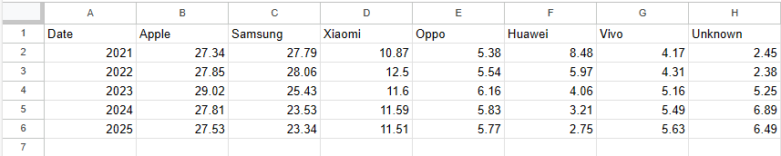
In this tutorial, we’ll use smartphone market share data from StatCounter to create waffle charts representing the market share of Samsung, Apple, and Xiaomi in 2024.
Step-by-Step: Building a Waffle Chart
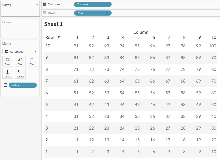
- Start by creating a data source with 100 rows, each representing a square in the waffle chart.
- To arrange the chart in a 10x10 grid, create two calculated fields:
- Row:
DIV([Index]-1, 10) + 1 - Column:
([Index]-1) % 10 + 1
- Row:
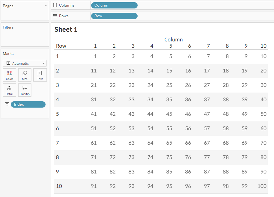
(For more details on how to create grid layouts in Tableau, refer to our article on "Trellis Arrangement in Tableau" This technique is useful when horizontal or vertical comparisons are difficult due to a large number of items.)
- To display the fill from bottom to top, reverse the sort order of the Row field.
- Use StatCounter’s smartphone market share dataset, specifically the 2024 values from
vendor-ww-yearly-2021-2025
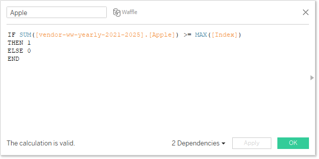
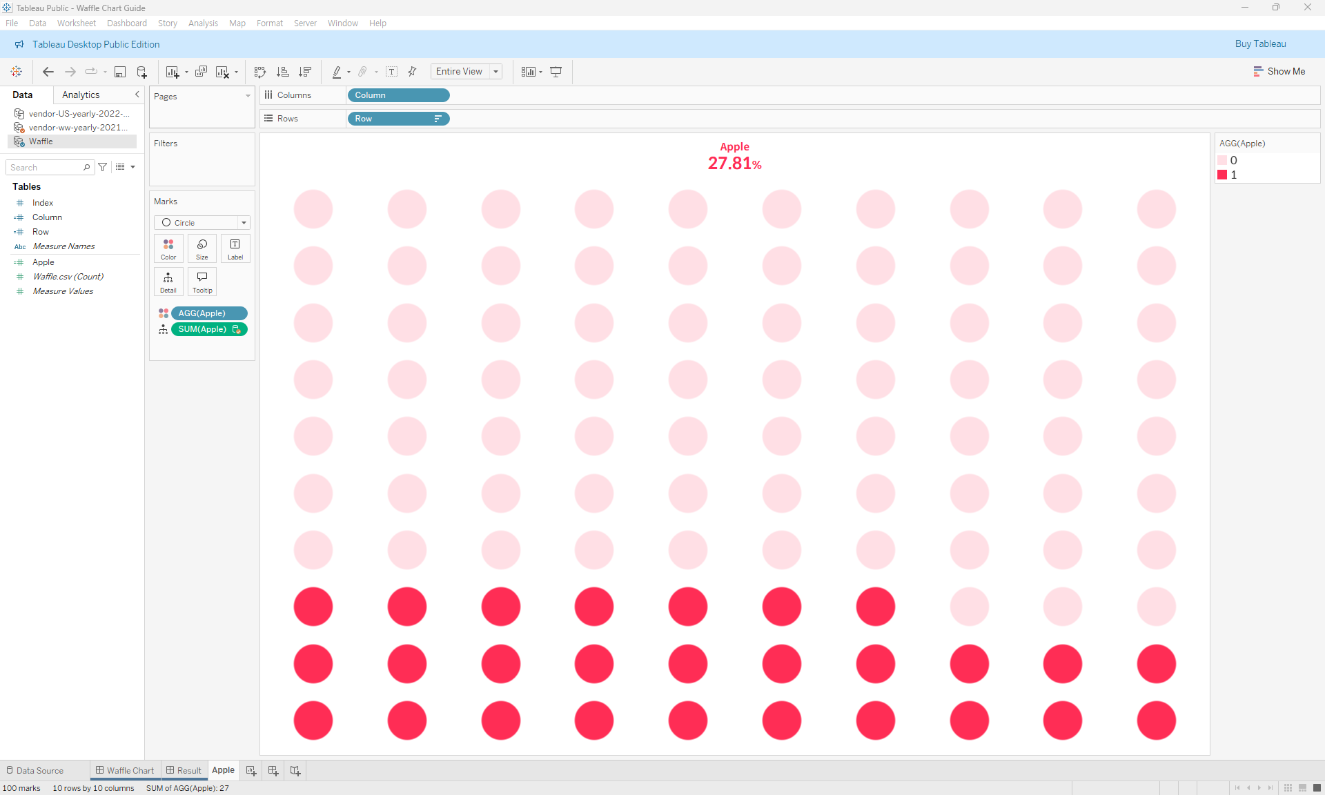
- In the Waffle data source, create a calculated field that references the
[Apple]field from thevendor-ww-yearly-2021-2025data source.
Since we’re creating a simplified version that doesn’t show decimal points, we’ll use this calculation to highlight all[Index]values less than Apple’s percentage.
(Depending on your needs, you can use theROUNDfunction.)
- Assign the calculated
[Apple]field to color, and change the mark type to Circle.
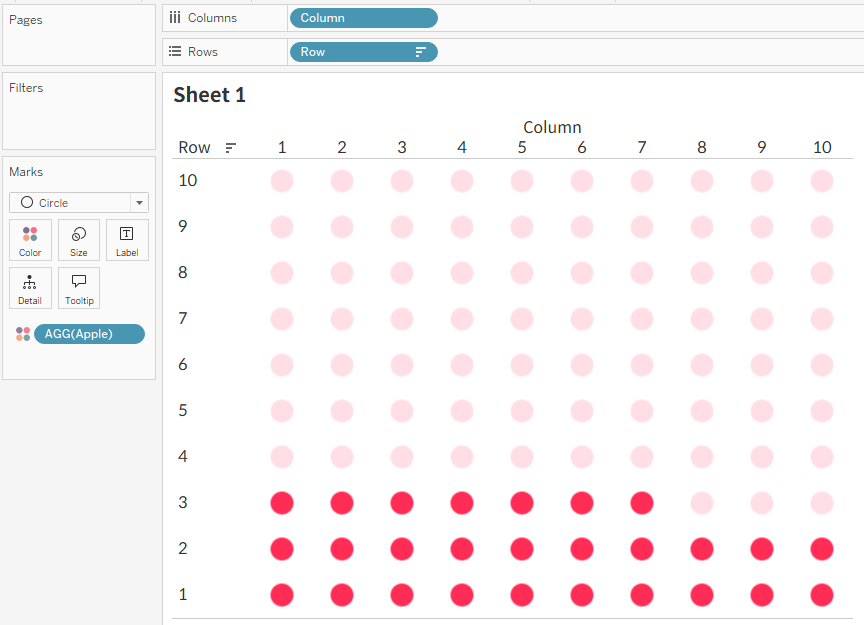
- Hide headers and adjust the formatting to complete the chart. Use the sheet title to show the percentage value simply.
- Repeat the same process for Samsung and Xiaomi to create additional sheets and combine them into a dashboard.